


When you’re working with data, it’s not enough to simply look at a bunch of numbers and hope they make sense. That’s where descriptive statistics comes in. Think of it as your personal data translator. It helps you take messy sets of numbers and turn them into something meaningful, like summaries, patterns, and trends that are actually useful. Whether you’re running a fancy research project or just trying to understand why your small business is making more sales in the afternoon than in the morning, descriptive statistics is your go-to tool.
But here’s the thing not everyone talks about: the shape of your data is just as important as the average or the range of values. Why? Because the shape tells you how your data behaves. Is it evenly spread out? Is it lopsided? Does it have a lot of extreme values popping up unexpectedly? These are the kinds of questions shape analysis can answer—and trust me, those answers can make or break your analysis.
To analyse the shape of your data, there are three big players to know:
- Skewness (a fancy word for figuring out if your data leans more to one side than the other, like a teeter-totter that’s off balance).
- Kurtosis (this tells you how “fat” or “skinny” the tails of your data are, or how extreme the extremes really are).
- Distribution (the overall pattern or layout of your data, like a bird’s-eye view of what you’re working with).
These measures might sound a bit intimidating, but they’re not as complicated as they first seem.
The Shape of Data – Why It Matters
You know how first impressions are important when meeting someone? Well, understanding the shape of your data is like getting the first impression that tells you what you’re dealing with. It’s not just about how high or low the numbers go; it’s about the story your data is trying to tell. And trust me, that story can make a world of difference in how you analyse, predict, and make decisions.
Why Should You Care About Data Shape?
The shape of your data answers some big questions. Is your data all nicely grouped in the middle, like guests gathered around a buffet table, or is it scattered everywhere like confetti at a party? Are there extreme values, like that one guest who piles all the lasagna onto their plate? The shape matters because it influences how you interpret patterns and relationships in your data.
For instance, many statistical methods make assumptions about your data being normally distributed (think of the familiar bell curve). But what if your data leans to the side or has heavy tails sticking out? If you ignore the shape, you could end up with misleading results and make decisions that leave you scratching your head later.
How It Impacts Decision-Making, Predictions, and Interpretation
Imagine you’re in finance and analysing investment returns. If most of your data is clustered on the lower end but there’s a big spike in high returns, you’d better take that into account. Otherwise, your predictions about future investments might be way off.
Or think about healthcare. A doctor who assumes that patient recovery times are consistent for everyone might overlook the fact that some patients recover much faster or slower than the average. By recognizing the shape of that data, they could adjust treatments to suit different cases better.
Even in marketing, understanding the data’s shape can be a game-changer. For example, if sales data shows a lot of purchases between 10 a.m. and 3 p.m. but tapers off sharply after that, a business might focus promotions during prime hours to maximize revenue.
Real-World Examples Where Shape Analysis Shines
- Finance: Say a hedge fund manager is analysing stock market returns. A negatively skewed shape could indicate more frequent small losses and a few big wins. Ignoring this could lead to bad risk assessments.
- Healthcare: A hospital tracking patient cholesterol levels might see a positively skewed shape. That spike on the high end might signal a specific group of patients needing urgent attention or lifestyle interventions.
- Marketing: A company looking at website traffic might find some “peaky” days with heavy spikes, usually when big sales are running. Not recognizing this seasonal shape could mean missing out on opportunities to drive even more traffic.
Understanding the shape of your data isn’t just optional; it’s a superpower. It gives you the clarity to make smart decisions, predict trends accurately, and avoid falling for misleading averages.
Key Measures for Analysing Data Shape
When you think about data, it’s easy to imagine rows and rows of numbers sitting quietly in a spreadsheet like a bunch of well-behaved students. But trust me, data is rarely that polite. It has quirks, tendencies, and yes, a shape. If you’re serious about making sense of it, you need to understand three key measures that can help decode its personality: skewness, kurtosis, and distribution. Think of them as the Sherlock Holmes, Dr. Watson, and Inspector Lestrade of data analysis.
Skewness
Ever been on a playground and noticed a see-saw with one kid who’s way heavier than the other? That’s skewness in action. It’s all about whether your data leans one way or the other.
What is skewness?
Skewness measures asymmetry in your data. Imagine your data as a party spread on a buffet table. If most of it (the food) is piled in the centre (the middle values) with only a little bit on the ends, you’re looking at symmetry. But if everyone’s crowding around one side, you’ve got skewness.
Types of Skewness
- Positive skew: The long tail stretches to the right. Think of salary data where a small group of ultra-rich individuals pulls the average higher. Most people earn less, a few people are billionaires, and voilà, positive skew.
- Negative skew: The long tail stretches to the left. Imagine retirement ages. Most people retire around 65, but a few superhuman workers stick around until their 80s.
- Zero skew: Everything’s perfectly balanced. Like your mom making sure every kid at the table gets the same serving of dessert. A rare unicorn in the real world.
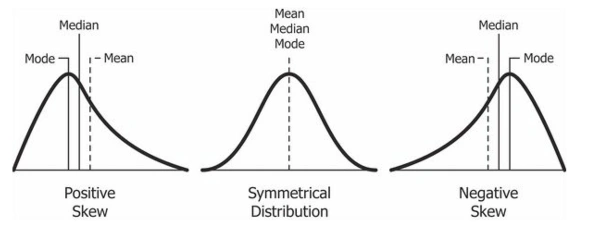
How Skewness Relates to Mean, Median, and Mode
As you can see, the values of mean, median and mode are linked with the skewness of the data. Let’s see how:
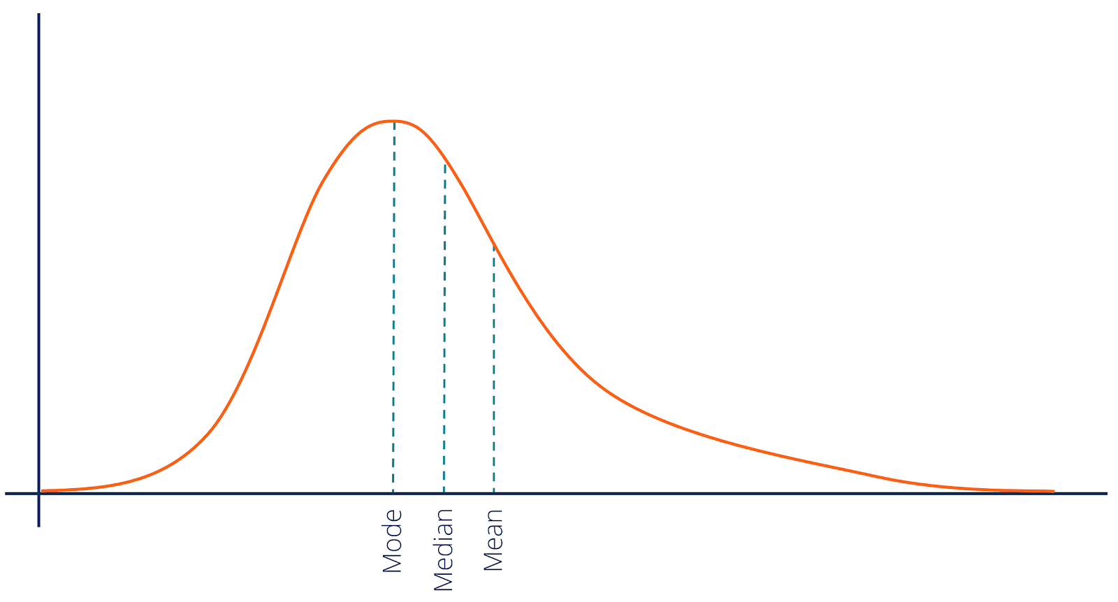
Positive Skew
When your data is positively skewed, the long tail of the distribution stretches out to the right—that is, toward the larger numbers.
The outliers (those big numbers in the tail) pull the mean higher than the median. The mode (since it reflects the most frequent value) is usually the smallest, clustered where most of the data lies.
Order: Mode < Median < Mean
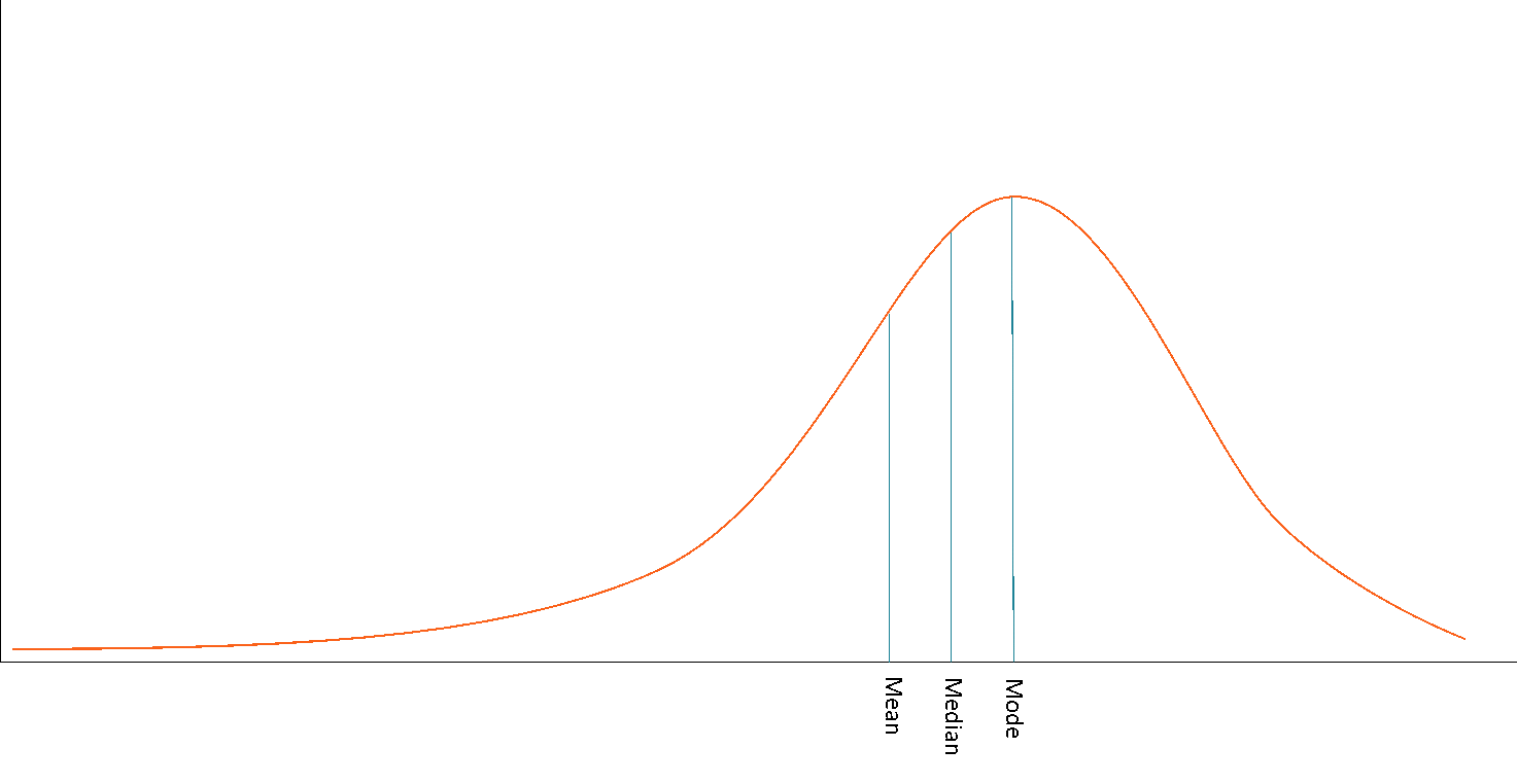
Negative Skew
When your data is negatively skewed, the long tail stretches out to the left, toward the smaller numbers.
Now the small outliers pull the mean lower than the median. The mode (still where most of the data sits) is typically the largest.
Order: Mean < Median < Mode
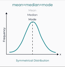
No Skew
If your data shows zero skewness (meaning it’s perfectly symmetrical like a classic bell curve), the mean, median, and mode all sit smack in the centre, nicely aligned. Perfectly balanced. As all things should be.
Order: Mean = Median = Mode
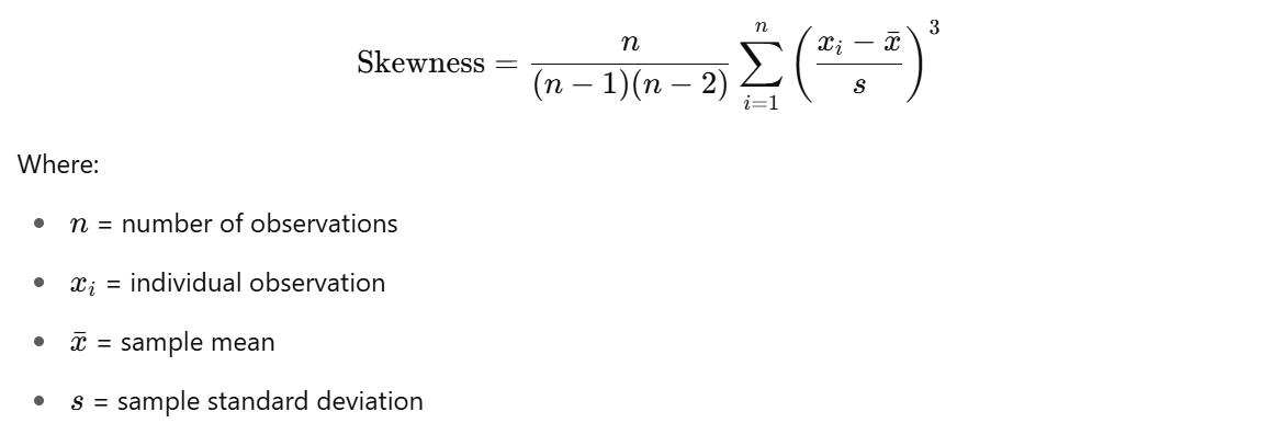
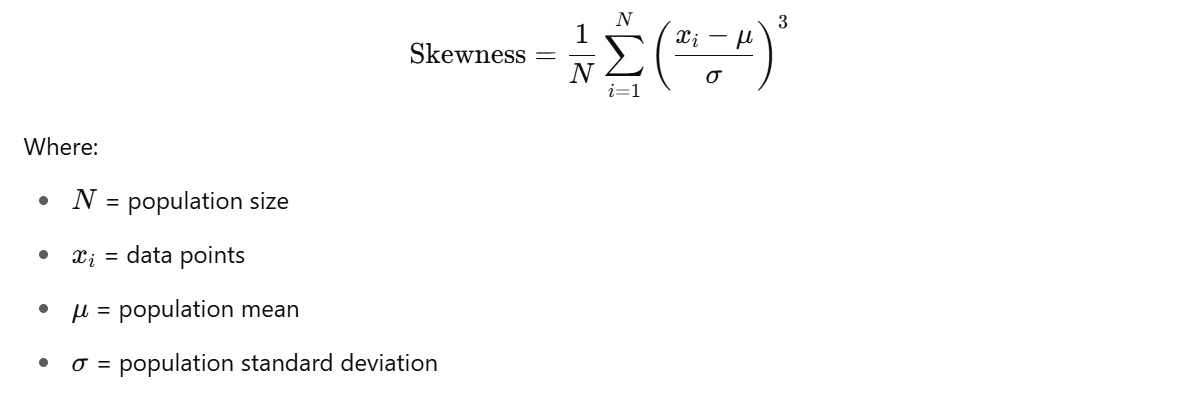
There are many ways to calculate skewness, but the most common measure is the Fisher-Pearson coefficient
Sample Skewness
Population Skewness
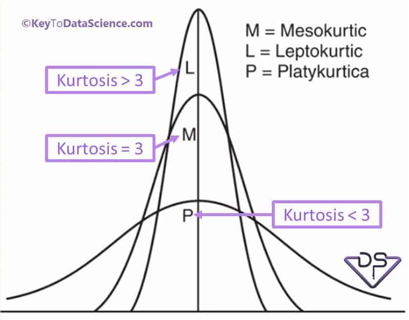
Kurtosis
If skewness is about balance, kurtosis is about personality. Specifically, how extreme your data is. You know that one friend who’s always either super chill or ridiculously intense? That’s kurtosis.
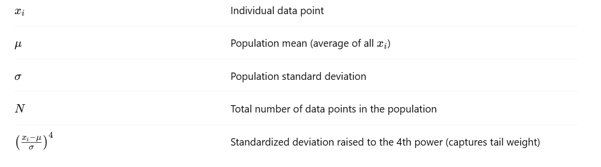
Kurtosis measures how “heavy” the tails of your data are compared to the middle. It tells you how many data points live at the extremes.
Types of kurtosis:
- Leptokurtic: Big bulges in the tails. Your data has extreme highs or lows. Think about a political poll where most people are passionately on one side or the other, with very few moderates.
- Platykurtic: Your data is flat and spread out, like a pancake. Everyone’s kind of doing their own thing with no extreme behaviour.
- Mesokurtic: This is the “Goldilocks” curve, falling somewhere in the middle—not too extreme, not too flat, just right.
So why does kurtosis matter? Well, in the world of finance, for example, it’s the difference between a stock that occasionally skyrockets or crashes (high kurtosis) and one that just plods along steadily (low kurtosis). In other words, kurtosis helps you understand the risk of extreme events—whether you’re analysing stock prices, weather patterns, or even the likelihood of a viral TikTok.
Raw Kurtosis or simply Kurtosis measures the tailedness of a distribution.
The Raw Kurtosis for a normal distribution is 3.
Excess Kurtosis makes it easier to compare a distribution’s shape to normal distribution.
where:
- 0 → normal distribution
- > 0 → leptokurtic: heavy tails (more outliers)
- < 0 → platykurtic: light tails (fewer outliers)
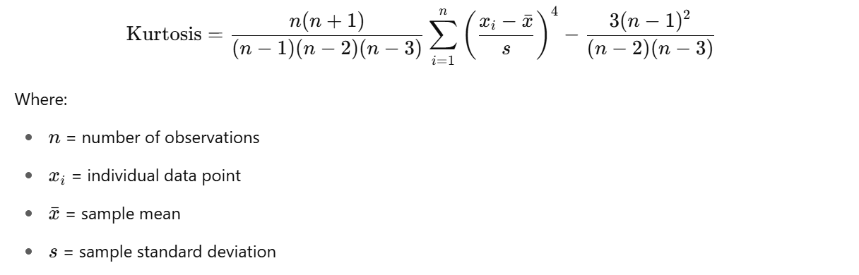
Here's the formula for Sample Excess Kurtosis
And for the population

To calculate the raw kurtosis, simply add 3. Don’t worry about the formula though, in most cases you’ll be using Python or R to do the lifting for you.
Practical Applications of Skewness and Kurtosis
Imagine this: You’re at a banquet, and the buffet offers an overwhelming assortment of dishes. But you notice something peculiar. Everyone is clustering around a single dessert table, creating an over-packed line, while other dishes go untouched. This uneven distribution mirrors what skewness and kurtosis reveal about datasets. They measure where the clusters are, what’s being ignored, and whether the outliers are just the crazed dessert fans or something more systemic.
Now, onto the juicy meat of how these concepts uncover unexpected insights in the real world.
1. Biz Whiz: Skewness and Product Sales
Ever wondered why Black Friday sales centre on just a handful of products? Retailers do, too. Analysing sales data often reveals a positively skewed pattern where a small fraction of products (hello, instant pots and flat-screen TVs) generate disproportionate revenue compared to the rest. This isn’t just a curious anomaly; it’s a goldmine for businesses. It’s why e-commerce platforms slap “bestseller” tags on hot items to amplify the hysteria. The long tail of skewed data? Those midrange products, like a $25 lamp, quietly filling carts alongside the blockbusters.
But the magic doesn’t end there. For inventory managers, knowing the skewness of sales helps decide where to invest storage capacity. And for marketers, positive skewness highlights ideal SKU candidates for upselling campaigns.
2. High Risks and Tail Spins: Kurtosis in Finance
Kurtosis makes fund managers rethink their game plans. The stock market is the ultimate leptokurtic playground, where extreme highs and lows lurk in the tails. A normal distribution of returns might reassure investors, but a leptokurtic distribution whispers, “Buckle up, it’s going to be a bumpy ride.” Case in point: the 2008 financial meltdown. Analysts who tuned into kurtosis might have caught those thick tails signalling disproportionate, catastrophic risks.
Nowadays, hedge fund managers use kurtosis metrics to detect volatile securities before they snowball into wolfish market catastrophes. It’s also why risk models like Value-at-Risk (VaR) continue to thrive in finance circles; they recognize that assuming “normal” just doesn’t fly when buying and selling billions.
3. Skewing Health to Detect Outbreaks
Healthcare applications veer into life-and-death territory. Skewness in patient recovery times or disease progression gives hospitals a data-driven insight into treatment efficacy. Take flu seasons, for example. Data that skews negatively (cases subsiding quickly for most patients) is a reassuring trend. But a sudden, positive skew showing prolonged recovery times for a minority might signal a nasty new strain. Public health officials who rely on anything else besides skewness in these scenarios risk dismissing red flags before they morph into full-blown pandemics.
Meanwhile, on the kurtosis side of the equation, understanding the “heaviness” of tails for rare diseases like ALS or genetic disorders ensures research funding is allocated where those small, extreme case clusters live. If 95% of population studies treat extreme conditions as rare noise, kurtosis makes sure they don’t remain overlooked.
4. Social Norms in Outliers
Here’s where we get all "Freakonomics" and tie human behaviour into a tidy, statistically-backed bow. Social scientists examining skewness in income distributions often notice societal preferences for equality (or lack thereof) buried in the tails. A positively skewed dataset, where the top 1% earn 20 times what the average worker does, isn’t just numbers on paper. It sets the tone for economic policy debates, labour strikes, and even populist elections. Skewness tells us not just about the haves and have-nots but gives ammunition to journalists revealing tales of, say, executive bonuses the size of small countries.
And kurtosis? It pops up in spotting social outliers too. Think cultural phenomena like viral TikTok challenges. Data might show 90% of fade-into-oblivion posts but pay attention to that tiny cluster in the upper tail racking up millions of views. Leptokurtics at its quirkiest.
5. Policing the Unseen in Manufacturing
Ford Motors might argue they’re statisticians just as much as manufacturers. Quality control departments live and breathe kurtosis when examining assemblies for defects. Flat or platykurtic distributions might suggest most products are passing consistent benchmarks. One sharp spike in those heavy tails? That’s the faulty batch causing customer complaints. The lesson here? Platykurtic distributions keep manufacturers relaxed while anything else ignites investigations.
On the skewness front, imagine a conveyor belt process producing widgets where most defects cluster around a specific timing anomaly (e.g., heat-sensitive adhesives setting imperfectly). Engineers analysing this pattern immediately tweak processes to fix just that one pesky bottleneck. No wild design overhauls, no extra costs.
6. Education Scores Speak Volumes
Ah, test scores, perennial playgrounds for skewness measures. Negative skewness often indicates that most students are acing material, with a few outliers dragging down the mean. A great reason for educators to focus on reinforcement categories like remedial programs. Conversely, positively skewed distributions (one Einstein pulling up the grade curve) may hint something else altogether—that the curriculum lacks challenge for high performers.
In high-stakes settings, like state-level academic assessments, kurtosis takes the spotlight. Extreme peaks in test score distributions can signal cheating, like a specific centre achieving 100% perfect scores. The magic of statistical tails is their ability to call out irregularities you’d otherwise miss by just squinting at averages.
Conclusion
Data isn’t just numbers; it’s a story, and skewness and kurtosis are the plot twists and character arcs that make the narrative worth reading. These metrics take us beyond the comfortable middle ground of means and medians, urging us to look deeper into the asymmetries and extremes. From the hidden inequities in income data to the volatile unpredictability of stock market returns, the shape of data reveals the nuances that averages often conceal.
But here’s the real kicker: how often do we, in life or business, rely on “normal” when the truth lives in the tails? Skewness and kurtosis teach us to question that norm and explore the outliers for what they can tell us about innovation, risk, and opportunity. Want to be the outlier in your field? Start looking at the data like one. Curious about how these strange-sounding concepts can shape your world? The next step is yours to take.
Dive deeper into the fascinating world of data shapes! The insights are waiting; are you ready to uncover them?
.jpeg)


.avif)

Lorem ipsum dolor sit amet, consectetur adipiscing elit. Suspendisse varius enim in eros elementum tristique. Duis cursus, mi quis viverra.